
Brand Visual Identity
BrandName: DOLMEN BAKERY
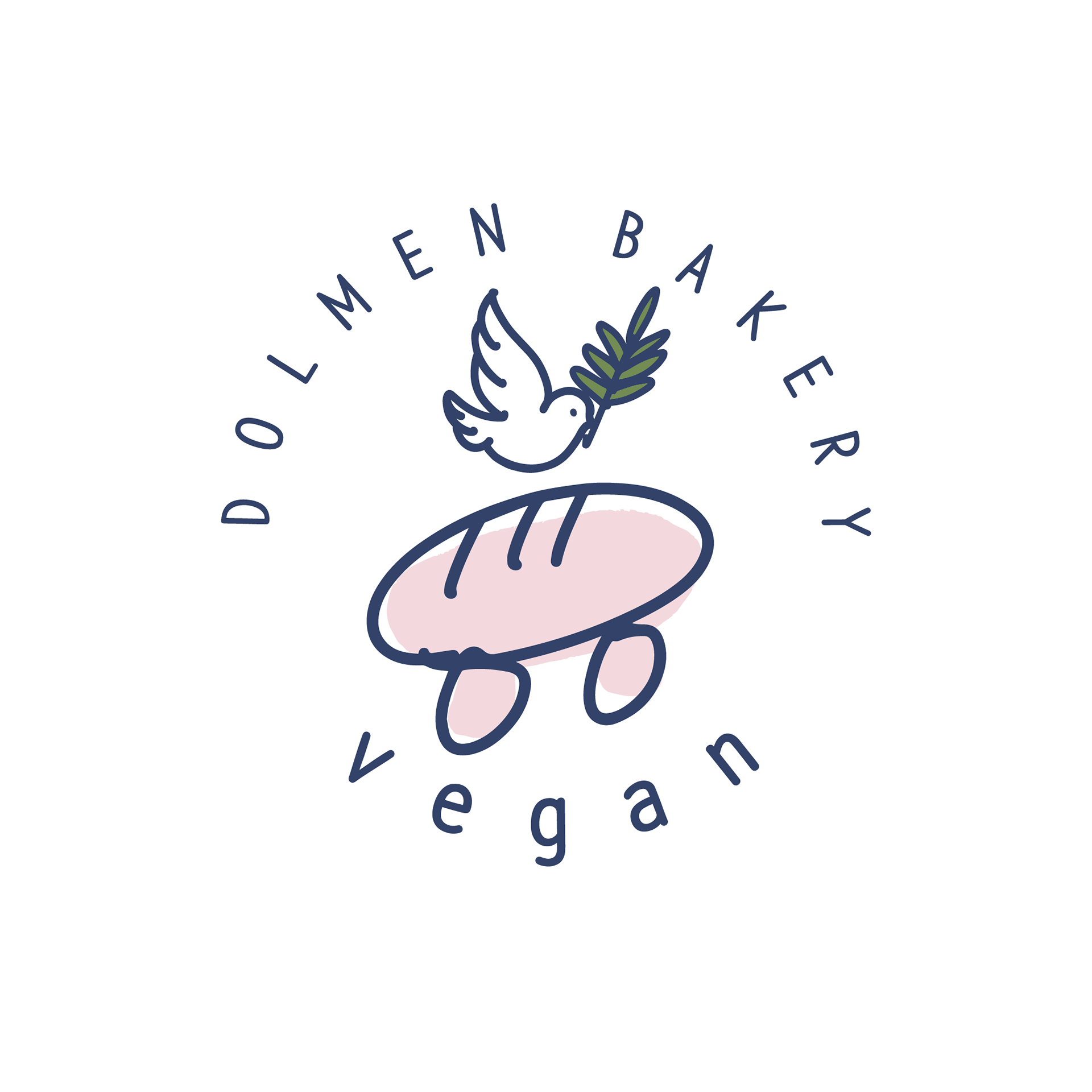
Concept Keywords : Local Heritage, Everyday Sanctuary, Vegan Bakery
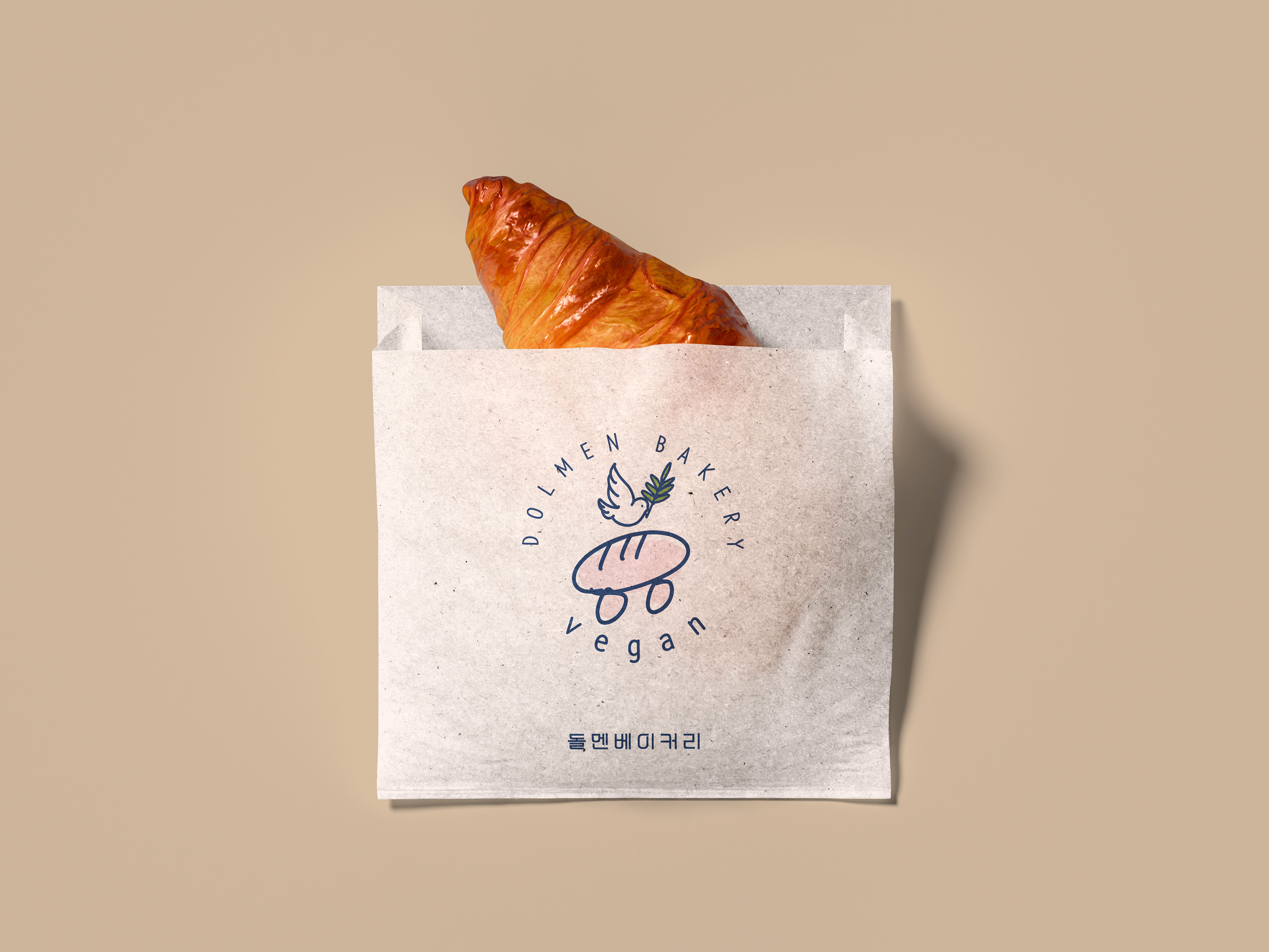
돌멘베이커리의 시각적 아이덴티티는 강화도의 상징인 고인돌(Dolmen)에서 출발합니다.
수천 년의 시간을 견뎌온 고인돌처럼, 자연과 사람의 삶 속에 오래 남을 수 있는 가치를 담고자 했습니다.
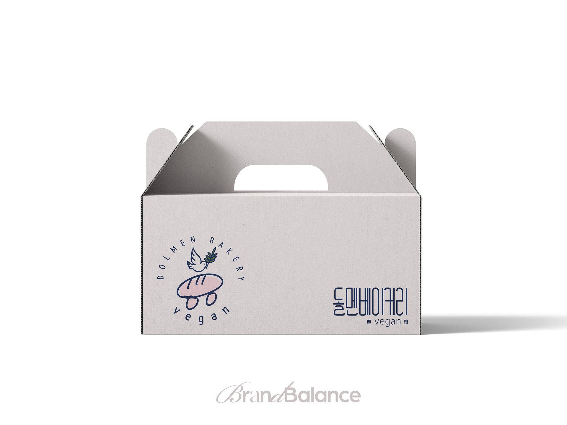
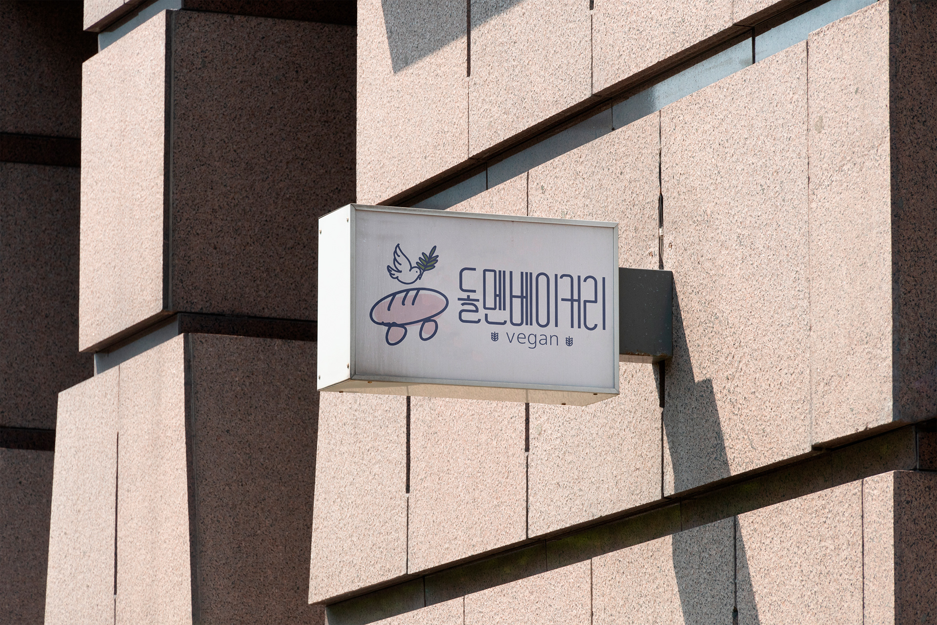
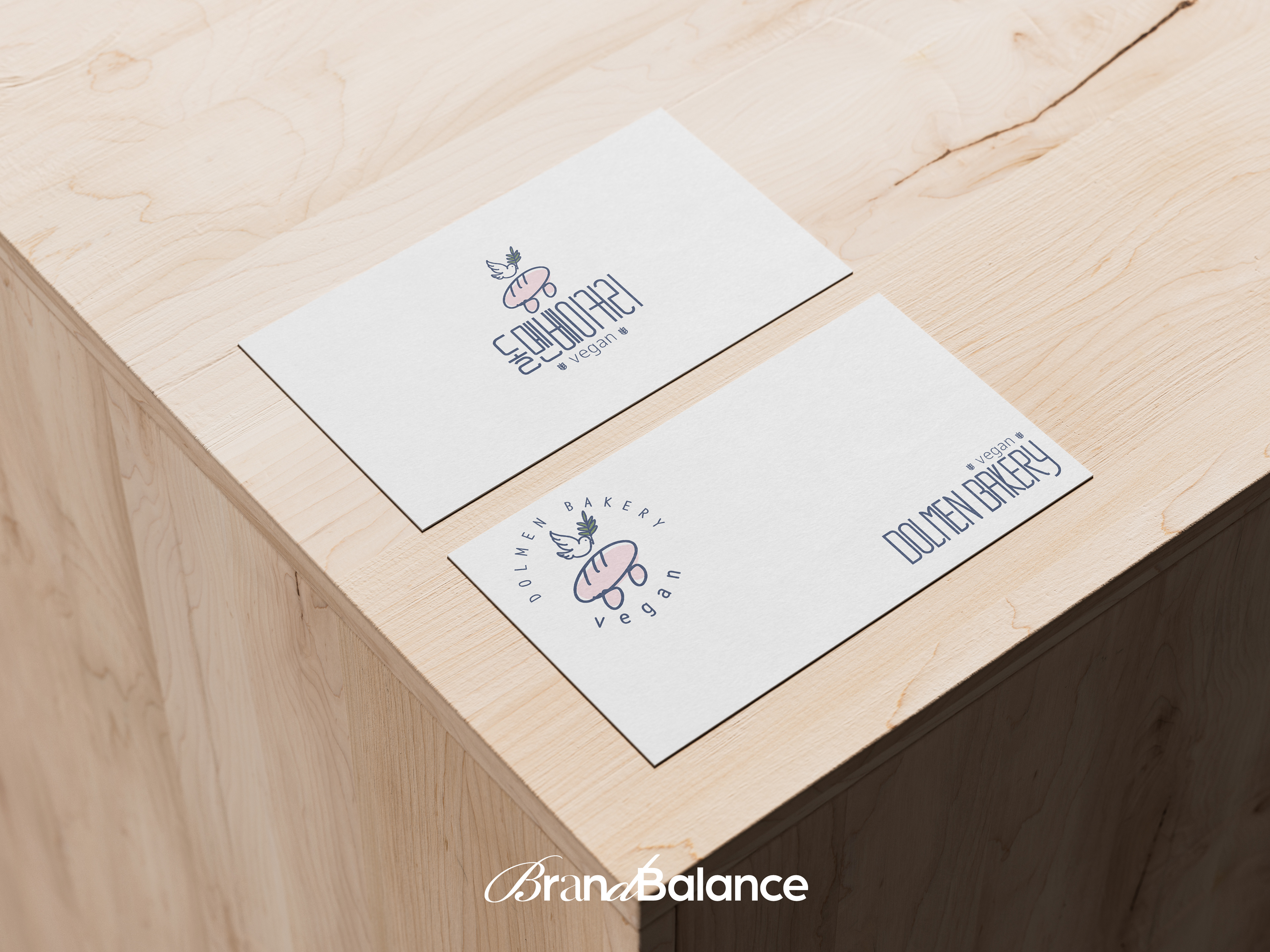
로고는 고인돌의 형태를 빵의 이미지로 재해석하여, 지역의 역사성과 비건 베이커리의 정체성을 결합했습니다.
단단함과 부드러움, 오래됨과 일상의 균형을 시각적으로 표현합니다.
단단함과 부드러움, 오래됨과 일상의 균형을 시각적으로 표현합니다.
돌멘베이커리는 강화도의 시간과 자연을 담아 바쁜 일상 속에서도 부담 없이 머물 수 있는 소박하고 진정성 있는 베이커리를 지향합니다.
*
The visual identity of Dolmen Bakery is inspired by the dolmens of Ganghwa Island.
Like the dolmen that has stood for thousands of years, the brand reflects lasting values rooted in nature and everyday life.
Like the dolmen that has stood for thousands of years, the brand reflects lasting values rooted in nature and everyday life.
The logo reinterprets the shape of a dolmen as a loaf of bread,
combining local heritage with the identity of a vegan bakery.
It expresses a balance between strength and softness, history and daily comfort.
combining local heritage with the identity of a vegan bakery.
It expresses a balance between strength and softness, history and daily comfort.
Dolmen Bakery aims to be a sincere and simple place
where people can pause and feel at ease in the middle of a busy day.
where people can pause and feel at ease in the middle of a busy day.

© 2025 Brandbalance. All rights reserved